How to Present a Logo to a Client So They Say Yes the First Time (2026 Guide)
Most logo rejections happen because of a weak presentation, not a weak design. This guide covers the full process working designers use in 2026, from framing the strategy to showing the logo in realistic mockups that make clients see their brand instead of a drawing.
A
Abdul Manan
·July 5, 2026·7 min read·51
How to Present a Logo to a Client So They Say Yes the First Time (2026 Guide)
Here is a truth that stings the first time you learn it. Clients rarely reject logos. They reject presentations. The same mark that gets dismissed in a rushed email attachment gets approved with enthusiasm when it arrives inside a story, shown on the client's own products, framed by the strategy that produced it. Junior designers send files. Working professionals stage reveals.
The short version of the method is this. Present live rather than by email, open by recapping the brief and the business goals, reveal the logo alone on a clean slide before you explain anything, then show it applied to two to five realistic mockups from the client's actual industry, and close by asking directly for approval. Each step exists to prevent a specific way presentations die.
Let us go through the whole process, including the part most guides rush past, which is how to build the mockup moment that does most of the persuading for you.
Why Emailing the Logo Kills It
When you email a logo, you surrender control of the first impression. The client opens the file on a phone between meetings, sees a mark floating on a white void with no context, and their brain does what every untrained brain does with an unexplained image. It hunts for something to dislike. Then they forward it to a partner, a spouse, and two friends, and now five people who never read the brief are voting on your strategy.
How to Present a Logo to a Client So They Say Yes the First Time (2026 Guide) | Mockupidea
A live presentation, whether in person or on a video call, fixes every part of that. You control the order of information, you answer objections the moment they form, and the decision happens in a room you are part of. Every serious guide on client work lands on this same point, and the designers who resist it are almost always the ones complaining about revision spirals.
Step One. Recap the Brief Before Showing Anything
Open the meeting with three or four minutes on what you both already agreed. Who the audience is, what the business goal is, what feeling the brand needs to project, what problem the old identity had. This is not filler. It reloads the criteria into the client's head so the logo gets judged against the brief instead of against personal taste.
There is a useful side effect too. If the client interrupts your recap to change the goals, you just discovered the project moved underneath you, and you found out before showing the work instead of after. That conversation is far cheaper now.
Step Two. Reveal the Logo Alone, Then Be Quiet
Put the mark on a clean full bleed slide, say something short like here is the new mark, and stop talking for a few seconds. Let the client actually look. Designers who talk through the reveal are managing their own nerves, and it reads that way.
After the pause, walk through the rationale. Why this shape, why this type, why this color, each choice tied back to a line from the brief you just recapped. Keep it under three minutes. Rationale is the frame, not the picture.
Step Three. The Mockup Reveal, Where Approval Actually Happens
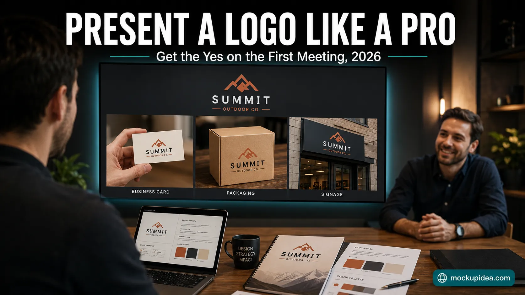
Now the step that separates presentations that close from presentations that stall. Show the logo living on real things. A logo on a white slide is an abstraction the client has to imagine into their world. The same logo on a storefront sign, a business card, a delivery box, or an app icon is their business, already existing, already better.
The rules that make this land.
Match the mockups to the client's actual industry. A restaurant gets menus, signage, and takeaway packaging. A consultancy gets business cards, letterheads, and a laptop screen. A product brand gets boxes and labels. Generic coffee mugs for a law firm tell the client you present the same deck to everyone. Our collections are organized for exactly this kind of targeting, with business cards at https://www.mockupidea.com/business-card, packaging at https://www.mockupidea.com/packaging, stationery at https://www.mockupidea.com/stationery, and outdoor signage at https://www.mockupidea.com/outdoor, all free with full commercial rights.
Use two to five scenes, never fifteen. Each additional mockup past five dilutes the impact of the strongest ones, and a bloated applications section makes the presentation feel like padding.
Choose scenes that feel like photographs, not templates. Clients have seen the same floating business card on a gray gradient a hundred times, and overfamiliar scenes quietly cheapen the work they carry. We wrote about how badly overused scenes perform in our article on mockup blindness at https://www.mockupidea.com/blog/mockup-blindness-why-buyers-ignore-etsy-listings-2026, and the psychology applies to client presentations exactly as it does to marketplace listings. If no existing template fits the client's unusual product, you can build a scene from any photo using the smart object method in our tutorial at https://www.mockupidea.com/blog/how-to-make-your-own-mockup-from-any-photo-2026.
One licensing note, since presentations are client work. Free mockups are fine to use here when their license allows commercial use, and the full rules live in our license guide at https://www.mockupidea.com/blog/can-you-legally-use-free-mockups-client-work-2026. The one habit to build now is delivering flattened images to the client rather than the template files themselves.
Step Four. Present One Direction, or Two at Most
The instinct to show six options feels generous and works against you. Too many choices push the client into comparison shopping mode, where they assemble a preference from parts, the mark from option two with the color from option five, and you end up negotiating a collage. One strong direction presented with conviction, or two genuinely distinct strategies at most, keeps the decision at the level of strategy where it belongs.
If you struggle to pick your strongest direction, that is the signal the work needs another pass before anyone presents anything.
Step Five. Ask for the Yes
Presentations that end with so, let me know what you think have volunteered for limbo. Close with a direct question. Does this direction feel right for where the business is going. Then handle what comes back, agree on any refinements with specifics rather than vibes, and put the next step in writing the same day.
If the client goes quiet or vague, resist the urge to fill silence with offers to revise. Ask what specifically feels off, and tie the answer back to the brief. Feedback anchored to strategy is workable. Feedback anchored to taste needs to be converted before you touch the design.
The Full Presentation Checklist
Live meeting booked, never a file dump by email.
Three minute recap of brief, audience, and goals.
Logo revealed alone on a clean slide, followed by silence.
Rationale in under three minutes, every choice tied to the brief.
Two to five industry matched mockups, customized past the default scene.
One direction, two at absolute most.
Direct ask for approval, next steps documented in writing.
How many logo options should I present to a client?
One strong direction, or two genuinely distinct strategies at most. Large menus of options push clients into mixing and matching parts, which destroys the coherence of every direction on the table.
Should I send the logo by email before the meeting?
No. Email surrenders the first impression to a context you cannot control, and invites feedback from people who never read the brief. Present live, then send files after the direction is approved.
How many mockups should a logo presentation include?
Two to five, all matched to the client's actual industry. Fewer than two misses the persuasion the applications provide, and more than five dilutes the strongest scenes.
What mockups work best for logo presentations?
Whatever the client's customers would actually touch. Restaurants get menus and packaging, service firms get cards and letterheads, product brands get boxes and labels. Realistic photographic scenes outperform obvious templates.
What if the client rejects the logo anyway?
Ask what specifically feels off and anchor the answer to the brief. Strategy based feedback produces a workable revision. Taste based feedback means realigning on goals before revising anything, otherwise you revise in circles.