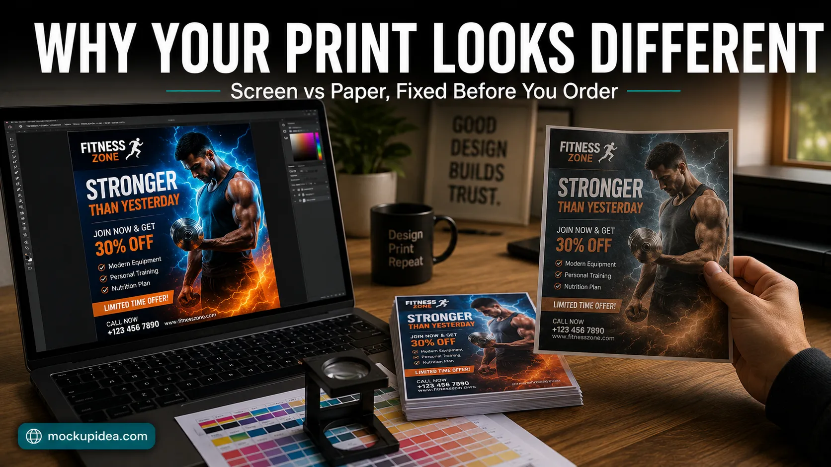
Why Your Printed Flyer Looks Different From Your Screen (And How to Fix It Before Ordering)
You approved a bright beautiful design on screen and the printer delivered something darker and duller. Nothing went wrong and nobody cheated you. This guide explains in plain language why screens and printers show color differently, and the simple checks that stop it from ever surprising you again.
A
Abdul Manan
·July 5, 2026·7 min read·44
Why Your Printed Flyer Looks Different From Your Screen (And How to Fix It Before Ordering)
It happens to almost everyone who orders print for the first time. You spend days perfecting a flyer, the colors glow on your laptop, you approve the file, and a week later a box arrives full of flyers that look darker, duller, and somehow cheaper than what you signed off. Your first thought is that the print shop ruined your order. In almost every case, they did not. What you ran into is the oldest gap in graphic design, and once you understand it, you can beat it every single time.
Here is the short answer. Screens create color with light and printers create color with ink, and ink physically cannot glow. Your screen mixes red, green, and blue light, a system called RGB, which produces vivid, luminous, sometimes neon colors. A printing press mixes cyan, magenta, yellow, and black inks, a system called CMYK, which works by absorbing light rather than emitting it. When your bright RGB design gets translated into ink, the colors that ink cannot reproduce shift toward the closest match it can manage, and that match is always darker and more muted.
Nothing in that process is a defect. It is physics. But you can control how much it affects your order, and the fixes take minutes.
Why Your Printed Flyer Looks Different From Your Screen (And How to Fix It Before Ordering) | Mockupidea
What Actually Happens to Your File at the Printer
When you upload an RGB file to a print shop, their system converts it to CMYK automatically before printing. Automatic conversion picks the nearest printable color for every pixel without asking you, and the flashiest colors take the hardest hits. Bright electric blues turn dusty. Vivid oranges lose their fire. Neon greens become olive. Rich glowing purples come out muddy.
The colors that survive translation well are the ones that already live inside what ink can do. Earthy tones, deep reds, navy, forest green, cream, charcoal, and black all print beautifully. This is one reason experienced print designers gravitate toward those palettes, and it is worth remembering when you design anything destined for paper.
Paper choice moves the result too. Glossy coated stock keeps ink sitting near the surface, so colors stay comparatively punchy. Uncoated stock soaks ink in like a towel, softening and darkening everything further. The same file printed on both stocks produces two noticeably different flyers, which is why reputable printers list the paper type before you order.
The Three Checks That Prevent the Surprise
You do not need design training to protect your order. You need three habits.
First, design in CMYK mode from the start when your software allows it. Photoshop, Illustrator, and Affinity apps all let you set the document color mode before you begin. Working in CMYK means the screen shows you a simulation of printable color the whole time, so there is no shock at the end. Free browser tools like Photopea support CMYK soft proofing too. Canva works in RGB internally, so if Canva is your design tool, at minimum choose their CMYK PDF export option and review the downloaded file before sending it anywhere.
Second, soft proof before you export. Soft proofing is a preview mode that simulates ink on paper using your chosen printer profile. In Photoshop it lives under View, then Proof Setup. Toggle it on and watch which of your colors dim, because those are the ones the press will change. If a color matters to your brand, adjust it now while it costs nothing. Our deeper walkthrough of this exact workflow, written for designers who prepare print files regularly, lives at https://www.mockupidea.com/blog/mockup-color-vs-print-the-cmyk-proofing-hack-2026.
Third, order a single proof copy before the full run. Every serious print shop offers one printed sample for a small fee. For a run of five hundred or a thousand flyers, that one sample is the cheapest insurance in the entire process. Approve the physical proof, then release the full order.
Seeing Your Design on Paper Before Paper Exists
There is one more tool that fills the gap between screen and print shop, and it is the one this site exists for. A realistic flyer mockup shows your design in a photographed scene, on actual paper texture, in natural lighting, held in a hand or pinned to a board. It will not simulate exact ink values the way a soft proof does, but it does something equally valuable. It shows you the design at real world scale and context, which catches the problems color proofing never sees. Text that is too small to read at arm's length. Margins that feel cramped on a physical sheet. A layout that works on a glowing screen but feels empty on paper.
A Plain Language Checklist Before Your Next Print Order
Set your document to CMYK mode before designing, or use your tool's CMYK export.
Keep must match brand colors inside ink friendly territory, and ask your printer for their color profile if a color is critical.
Soft proof the file and adjust anything that dims badly.
Preview the design in a realistic flyer mockup to check scale, margins, and readability on paper.
Order one physical proof before the full run.
Choose your paper stock deliberately, glossy for punch, uncoated for a natural feel, knowing each shifts color differently.
Follow those six and the box that arrives will match the design you approved. This gap between screen and print is also, quietly, one of the reasons print marketing feels premium again in a world drowning in glowing screens, an idea we explored in our piece on why print is exploding in the AI era at https://www.mockupidea.com/blog/why-print-marketing-exploding-ai-world-2026.
FAQ
Why do my printed colors look darker than on screen?
Screens emit light and printers reflect it. RGB screen colors can glow at intensities that CMYK ink physically cannot reproduce, so the press substitutes the nearest printable color, which is always darker and more muted than the glowing original.
Is the print shop responsible for the color difference?
Almost never. Automatic RGB to CMYK conversion is standard practice, and the shift it causes is physics rather than error. Shops are responsible for gross defects, not for ink being unable to glow like a screen.
How do I make sure my flyer prints the way I designed it?
Design in CMYK mode, soft proof before exporting, preview the layout in a realistic mockup for scale and readability, and order one printed sample before approving the full run.
Does paper type change how colors print?
Significantly. Glossy coated paper keeps ink near the surface and colors vivid, while uncoated paper absorbs ink and softens everything. The same file produces visibly different results on different stocks.
Can I check my design on paper without printing it?
A realistic flyer mockup is the closest thing. It shows your design on photographed paper texture at real world scale, which catches readability and layout problems before you spend anything on printing.